How To Read Trading Chart Patterns
The brands listed on this site are carefully researched, and we may earn fees from some. However, our recommendations are driven by our independent opinions. The information provided on this site is for educational purposes only and we strongly encourage you to do your own research before making any decisions.
Chart patterns are clear and distinctive chart formation patterns. They are a crucial part of technical analysis because they guide traders on what trades to make. The good thing about these patterns is that they very common.
In fact researchers have thoroughly documented and analysed these chart patterns. They analysed their reliability and statistical probability of a bullish or bearish scenario playing out after a pattern completes.
This means that learning how to spot chart patterns is fundamental for any trader. Moreover traders need to keep in mind the statistical probability of patterns so that they can trade effectively.
To clarify there is no such thing as a crypto chart pattern or stock market chart pattern. Chart patterns consistently appear across all market charts.
Chart patterns fall within 3 types of patterns in technical analysis:
- Continuation patterns – This is a continuation of the overall trend of the market. So if the trend was bullish before the pattern started it will continue as a bullish cycle.
- Trend reversal patterns – This is when the trend of the market changes. So bullish cycles before the start of the pattern change to bearish. On the other hand bearish cycles change to bullish cycles.
- Bilateral patterns – These patterns are neither continuation patterns nor trend reversals. They can go either way.
I will cover how to read chart patterns and their relevant information once we cover the reliability of chart patterns.
Reliability of Chart Patterns
Before you go staking your life on chart patterns I have one word of advice. Technical analysis is about probabilities of an outcome – they are not certainties.
Especially because there might be some other overarching factors that change things. As a result they will have an impact on price action under certain market conditions.
So like with any technical analysis method there is always a margin of error. However there are some chart patterns that are more or less reliable than others.
With chart pattern we talk about success rates. That means how many times the bullish or bearish probability is pans out.
You should bear in mind that the success rate of chart patterns applies if and when they complete. In other words the ones that form the full pattern from start to finish. Not ones that are half baked.
A pattern is labelled as a success usually on one condition. That is to say when the breakout is equal to or longer than the move before it started. However there are some exceptions. For example with a head and shoulders pattern the breakout needs to stretch longer than the head.
Statistical Reliability of Chart Patterns
| Chart Pattern | Bullish / Bearish | Success Rate |
| Bear flag | Bearish | 68% |
| Bull flag | Bullish | 67% |
| Ascending channel | Bearish | 73% |
| Decending channel | Bullish | 73% |
| Ascending triangle | Bullish | 73% |
| Decending triangle | Bearish | 73% |
| Bearish rectangle | Bearish | 80% |
| Bullish rectangle | Bullish | 78% |
| Bearish pennant | Bearish | 55% |
| Bullish pennant | Bullish | 55% |
| Double top | Bearish | 75% |
| Double bottom | Bullish | 79% |
| Triple top | Bearish | 78% |
| Triple bottom | Bullish | 79% |
| Head and shoulders | Bearish | 83% |
| Inverted head and shoulders | Bullish | 83% |
Common Chart Patterns In Technical Analysis
In this next section you will find all the information of the chart patterns listed in the table. Alongside a couple of others.
Flags
Market Direction
- Bull flag – 67% success rate
- Bear flag – 68% success rate
- Continuation pattern
How They Look
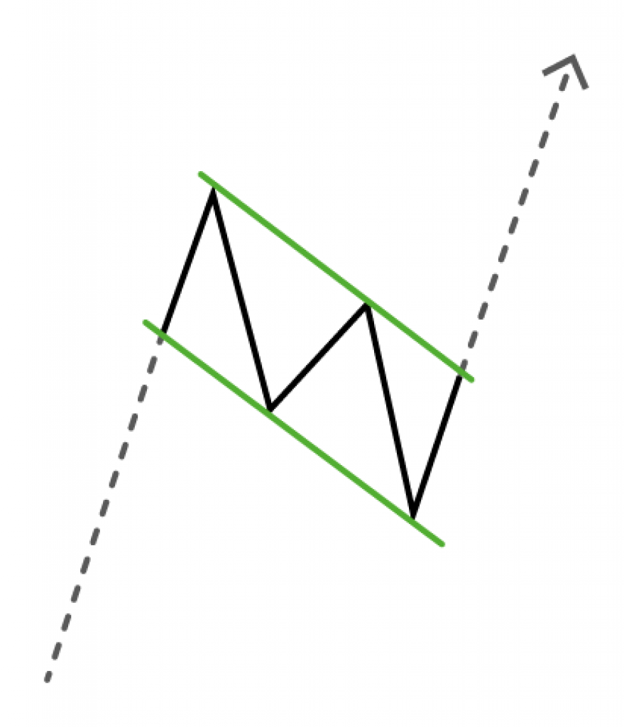
Bull and bear flags form when the bottoms and the tops of this pattern keep within a range. If you draw a line resting on the top and another touching the bottom values you get two parallel lines.
These lines either slope up or down. The price of the asset stays within this range for a while until it breaks up or down.

Notes
Bull and bear flags are very similar to channels. However flags are very slightly less reliable than channels.
Flags and channels incline in the opposite direction to where the market usually ends up. So it is like a trap for traders who do not know any better.
That means descending flags and channels are actually bullish chart patterns. On the other hand ascending flags and channels are bearish chart patterns.
Channels
Market Direction
- Ascending channel – Bearish chart pattern, 73% success rate
- Descending channel – Bullish chart pattern, 73% success rate
- Continuation pattern
How They Look
Channels are very similar to flags because the chart data stays within two parallel trend lines. However they usually are wider so they have more time to form. As a result they have more data. In fact because they have more data they are marginally more reliable than flags.


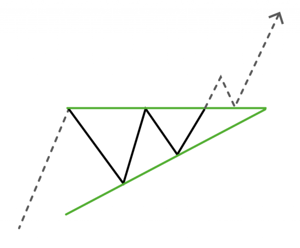
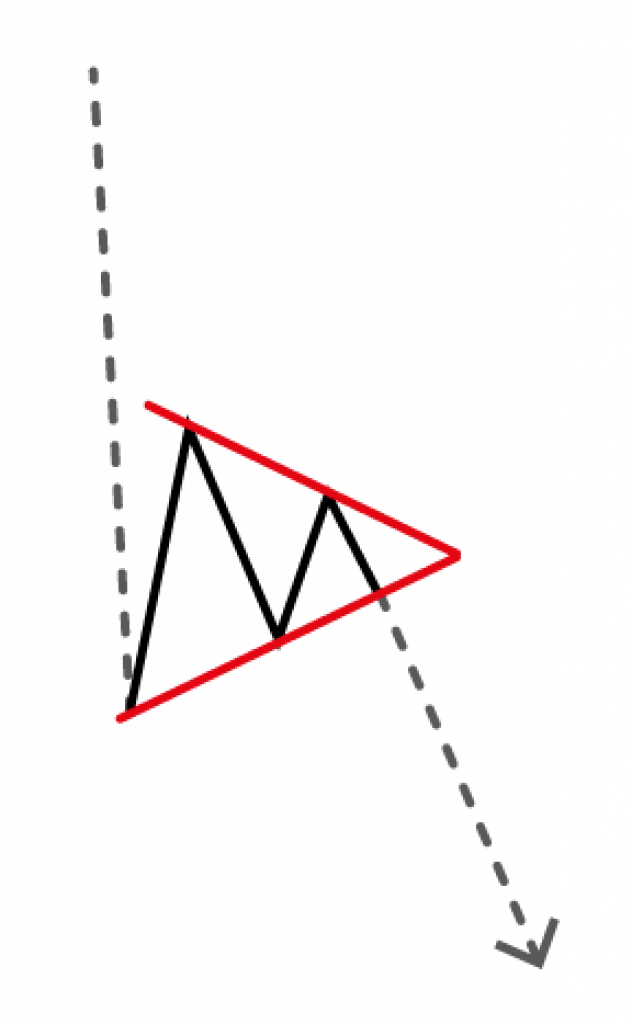
Triangles
Market Direction
- Ascending triangle – Bullish chart pattern, 73% success rate
- Descending triangle – Bearish chart pattern, 73% success rate
- Continuation pattern
How They Look
You can draw two lines at the top and bottom of the highs and lows of a triangle. The two lines will meet at a point on the right where newer chart data comes in.
If the triangle has one of these lines that is parallel to the x-axis then it is a triangle. As opposed to a symmetrical triangle or a wedge that have both lines either ascending or descending.

Notes
Triangles are a form of consolidation where the price of a market is stable for a while. As a result the overarching trend has some time to gain additional strength. That is to say before it continues on the trend path.
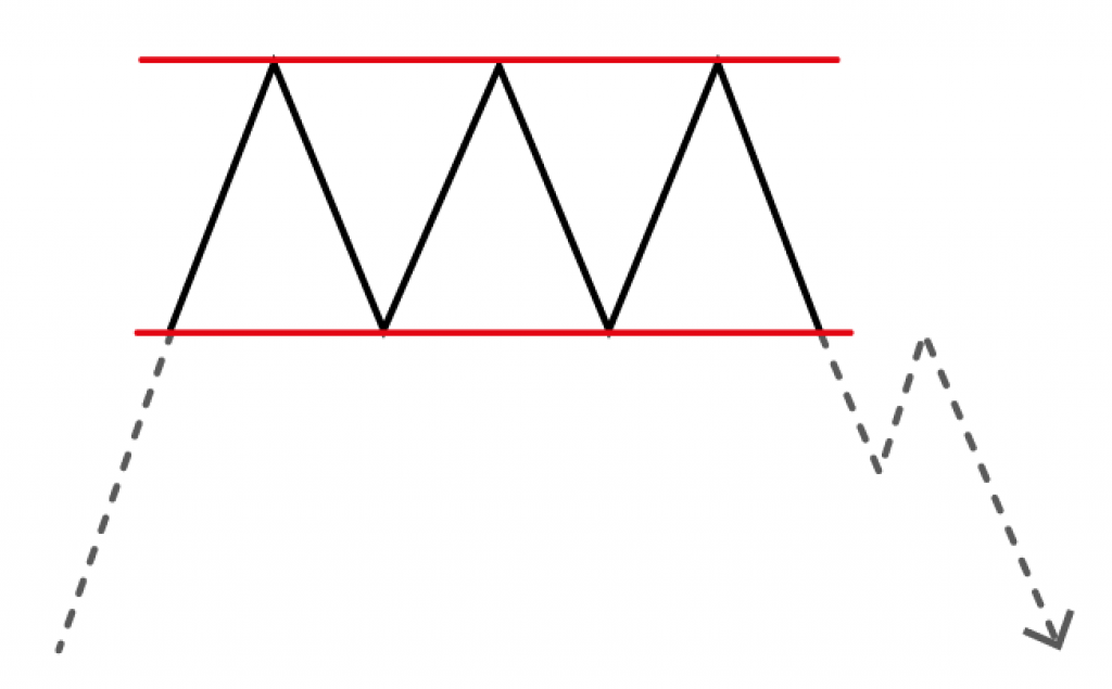
Rectangles
Market direction
- Bearish rectangle – 80% success rate
- Bullish rectangle – 78% success rate
- Continuation pattern
How They Look
Rectangles are similar to channels, but they do not slope up or down. If you draw two lines that go across the highs and the lows they end up parallel to the x-axis.
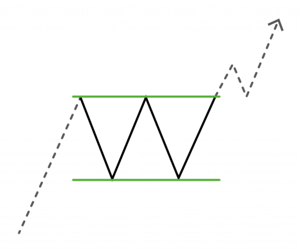

Notes
Rectangles have a higher success rate than any other chart pattern that is sloping. Like for example channels, flags, triangles etc. This is because they are a better form of consolidation.
Rectangles are failed double tops or bottoms or triple tops or bottoms. So you have to be very careful when you analyse these two chart patterns.
Sometimes the chart will already have shown signs of weakness if in a bull market. However in the case of a bear it would show signs of loosing steam.
Moreover there are other tools and data like fundamental analysis, macroeconomics etc. that can help traders figure this out.
Pennants
Market Direction
- Bullish pennant – 55% success rate
- Bearish pennant – 55% success rate
- Continuation pattern
This is one chart pattern that has one of the lowest success rates. It’s almost as bad as if you had to toss a coin and bet on which direction the market will go.
How They Look
Pennants are similar to symmetrical triangles. If you had to draw a line crossing the tops and the bottom values you would see them converge. Usually the converging point of the lines form a triangle shape that looks symmetrical.
The lines do not point up or down, but sideways. Otherwise if the lines are pointing up or down that is called a wedge.
Additionally pennants also have a flagpole whereas symmetrical triangles do not. A flagpole forms when there is a sudden price movement. It is usually almost vertical.
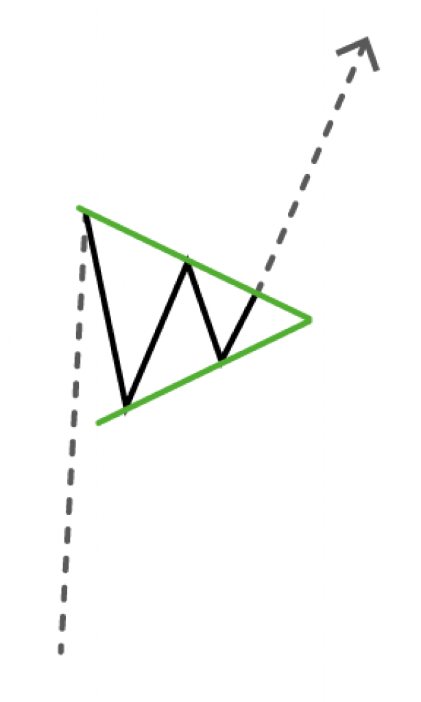
Notes
Another difference between pennants and symmetrical triangles is data. Pennants do not have as much data because they do not last as long. Usually they last as much as a day to several weeks.
Symmetrical triangles last longer so the triangle is usually wider and encapsulates more data. Hence why pennants are one of the least reliable chart patterns.
If a pennant chart pattern goes over 13 weeks it is likely a triangle.
Double Top and Double Bottom
Market Direction
- Double top – Bearish chart pattern, 75% success rate
- Double bottom – Bullish chart pattern, 79% success rate
- Trend reversal
How They Look Like
Double tops and bottoms are exactly like what they sound.
Double bottoms are when a market reaches its lowest point. After that there is a slight bounce up before it goes down again to make another low. The next low is approximately at the same level in regards to price as the previous one.
Double tops are the same, but inverted. So this chart pattern makes one last final higher high before it turns around to start a downtrend.
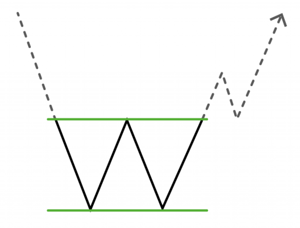
Notes
Sometimes double tops and double bottoms go on to form triple tops and triple bottoms.
A lot of the time double bottoms and tops can produce breakouts that fail. However once the breakout extends past the distance between the high and low it is a success. At that point analysts can confirm the trend reversal. It applies for both double bottoms and tops.
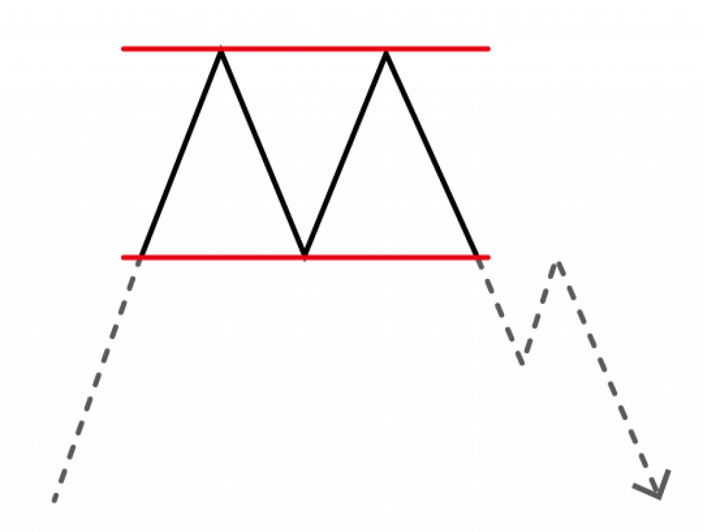
Triple Top and Triple Bottom
Market Direction
- Triple top – Bearish chart pattern, 78% success rate
- Triple bottom – Bullish chart pattern, 79% success rate
- Trend Reversal
How They Look Like
Triple tops and bottoms are just like double tops and bottoms. However they touch a price point 3 times instead of twice.

Notes
Just like the difference between flags and channels triple tops and bottoms have more data. Hence they are very slightly more reliable than double tops and bottoms. To clarify, triple tops are 2.58% more reliable and triple bottoms are 0.78% more reliable.
Failed double or triple tops and bottoms are actually rectangles. So it is important for any trader not come to conclusions too quickly with these two chart patterns.
Head And Shoulders
Market Direction
- Head and Shoulders – Bearish chart pattern, 83% success rate
- Inverted Head And Shoulders – Bullish chart pattern, 83% success rate
- Trend reversal
Head and shoulder patterns are the most reliable out of all the chart patterns.
How They Look
The head and shoulders pattern forms 3 peaks. Similarly to our body structure the head is at the centre and is higher than the other two peaks.
The base of the head and shoulders peaks is called the neckline. You can find where the neckline is by drawing a straight line across the two base points of the head.
The line might not necessarily end up parallel to the x-axis of the chart. Sometimes both head and shoulders and inverted head and shoulders patterns are tilted.


Notes
The head and shoulders patterns have 2 shoulders. When traders refer to them they are known simply as the left and right shoulder.
Head and shoulders patterns is a chart formation that shows a trend reversal. So a head and shoulders pattern could show up at the end of a bull market. On the other hand an inverse head and shoulders could signal the end of a bear market.
Rounding Top and Rounding Bottom
Market Direction
- Rounding Top – Bearish
- Rounding Bottom – Bullish
- Trend reversal
It is hard getting statistical information on the success rate of this chart pattern. However it is considered a good trend reversal pattern.
How They Look Like
Rounding bottoms form a ‘u’ shape of a cup. On the other hand rounding bottoms form an upside down u shape.
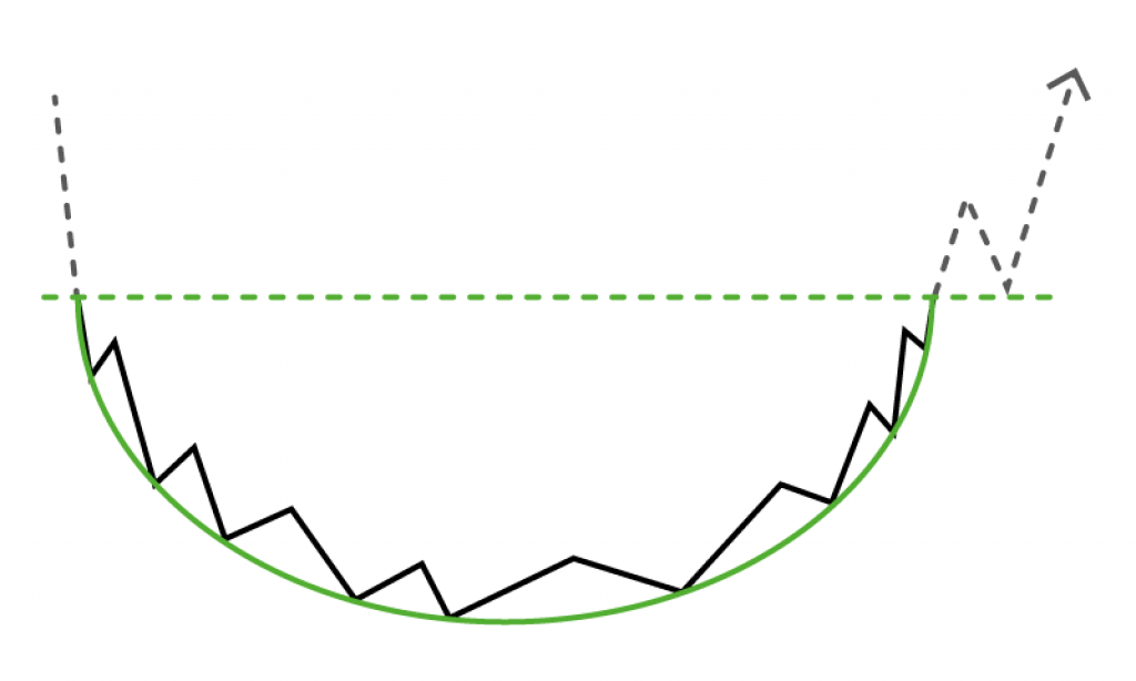

Notes
A rounding top is also called a reversed saucer.
The cups that have more clear and pronounced u shapes are far more robust. So if they are more abrupt and v-shaped they are not as reliable. As a result the more u-shaped cups have a greater chance of going into a bullish or bearish trend.
Cup and Handle
Market Direction
- Cup and handle – Bullish
- Inverted cup and handle – Bearish
- Continuation pattern
It is also hard getting statistical information on the success rate of this chart pattern. However it is one of the most bullish chart patterns you can encounter. The inverted cup and handle is equally one of the most bearish chart patterns.
How They Look Like
A cup and handle firstly forms a rounded bottom cup that is followed by a handle right after it completes. The handle is usually sloping downwards and could end up becoming a flag or pennant pattern. However this is not always necessarily the case.
The cup usually pulls back and bottoms to around 1/3 to 1/2 of the highest recorded market value. Then it goes on gradually up to match the previous market top before it forms the handle.
Everything that applies to the cup and handle is the opposite for the inverted cup and handle. It looks just like a cup and handle, but upside down.
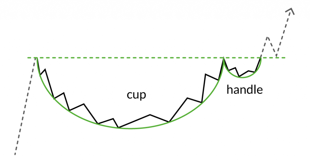

Notes
There is no time frame for cup and handle technical analysis patterns. For some reason, people say cups and handles are seen on daily and up until yearly charts. In fact they are by far seen most often on shorter time frames.
However cup and handle patters can also form over decades. Here is an example of silver’s 40-year cup and handle pattern.
Free Chart Patterns Cheat Sheet

You may want to come back to this web page as a reference in the future. However here is a free and handy printable chart patterns pdf in A4 size.
It features the patterns on this page with their most basic. You can download it and print it out for easy reference.
Best Technical Analysis Books

You may want to come back to this web page as a reference in the future. However here is a free and handy printable chart patterns pdf in A4 size. It features the patterns on this page with their most basic. You can download it and print it out for easy reference.
Chart Patterns Conclusion
To sum up – most traders consider chart patterns a crucial tool that is important to use. However it is good to know that not everyone thinks this is the case and there isn’t consensus.
In fact I need to point out that very few traders are successful at trading. This is mainly for two reason.
Firstly because people do not master how to do chart analysis properly. In fact if you have a mentor it would really help. This is not just because you can learn how to apply the rules correctly. However you will get exposed to more tools and information so you can learn more.
It can help you avoid making mistakes especially at the beginning. Like for example mistaking rectangles for double or triple tops and bottoms. It is best if you do not to make quick conclusions on what you are seeing.
You can find people on YouTube that can share their knowledge. Every now and then I like to follow Allessio Rastani or Blockchain Backer for crypto technical analysis.
Alternatively there is also the team at The Crypto Vigilante who are super good with figuring out crypto trends. Since crypto is still new there is no one else doing analysis like they do. However TCV is a subscription service that you will need to pay for. They are not financial advisors, which means they are not as expensive.